East Carolina University’s athletic department is branded with a unique, distinctive mascot any student could recognize immediately.
Officially known as “PeeDee,” the cartoonish pirate adorned in the university’s purple and gold colors represents the school. Even more popular is the athletic department’s logo which is an angry skeleton head outfitted with a pirate hat and eyepatch.
Greg Corack, the associate director of Leadership and Programs, calls the famous symbol the school’s “Skull and Crossbones.” Corack and department leadership were enamored with the mascot due to its popularity with students.
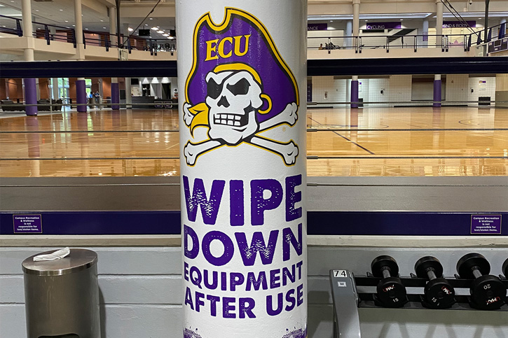
By 2018, ECU Campus Rec transformed its main facility to match the athletic department’s colors. They also officially adopted the “Skull and Crossbones” as their own.
The change has provided a positive, fresh restoration for the campus rec department.
How the Idea Began
ECU’s Richard R. and JoAnn M. Eakin Student Recreation Center first opened in 1997.
Around that time, the department made a concerted effort to have its own identity separate from athletics. That reasoning led to the building being painted with teal and maroon colors like other institutions in North Carolina.
“In 2012 we began discussing repainting options for the building,” said Corack. “We decided to change our paint scheme to purple and gold. From 2015-2018 we repainted the entire facility.”
In that same period, they changed the building’s signage and added the athletic department’s logo to their signs. They also included the logos on the basketball courts in the rec center where they were sanded and refinished.

Partnership with Athletics
To make this idea a reality, Campus Rec worked directly with ECU Athletics and developed a positive connection.
“Athletics is protective over its logos but has a standing agreement that we can use its identifiers with approval for sports-related facilities,” said Corack. “We are also a primary stop for Athletics recruiting tours and showing a facility with its branding and colors is great for the overall image.”
He added establishing a relationship with the Athletics’ chief licensing contact is essential in the process of using its branding.
The only cost that came with rebranding was putting an identifier to signage, and the logos were roughly $5,000 per basketball court.
“It did not cost us any extra money to change colors as we were already budgeting to repaint the facility after 20 years,” said Corack.
Reaction and Advice
Since rebranding finished in 2018, Corack noted the response from the rest of campus has been very positive.
“Students love the purple and gold colors and the Athletics identifiers in the building,” he said. “They want them in the background of their pictures. It helps when our Admissions tours come through as students can see what it means to be part of the Pirate community. Multiple staff members noticed the new paint colors immediately and commented on how inviting the space seems.”
Another added benefit of the change is the fresh paint and signage helps dress-up aging aspects of the facility. The makeover provided new life while avoiding a full building remodel.
EXTRA CREDIT: If considering facility improvements, it’s important to provide financial value.
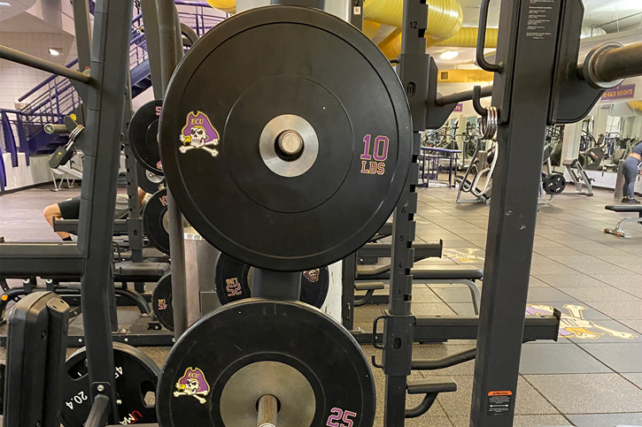
The branding extends further than just the walls of the rec center, however. Athletics branding can be found on dumbbells and weight plates in the gym area and on the department’s fleet of vans.

If you are considering starting a similar partnership with your athletics department, Corack said the biggest factor to consider is your student body.
“Survey your students and ask what they want prior to making any significant changes,” said Corack. “Also, meet with your licensing staff in athletics and gather their thoughts. Use licensed vendors, make sure they know the licensing process and don’t go overboard. Changes should be subtle, and you need to make sure you still have your own identity.”


